In a 5S Kaizen event, we eliminate as much from the work area as we can. What remains, we locate as close to the Point of Use (POU) as possible.
One of the tools we use to determine where to locate things is the Distance vs. Frequency Chart.
We start by monitoring the tools used at the station in the course of performing that job. Using a check sheet, we simply tick off each time that tool is used.
Using a Spaghetti Diagram (discussed in a previous post), we record the distance the operator walks to get it.
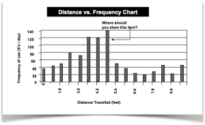
Putting the two together, we create the Distance vs. Frequency Chart.
Now, we get a picture of how we’re wasting time. If we look at the tallest bar in the chart, we see that the operator walks five feet to get that particular tool; not all that far, but they do it 140 times a day.
What did we learn? By knowing how often we use something, and how far we travel to get it, we get a good idea of how to reorganize our workplace.
For the sake of argument, let’s presume that tool you’re walking to get is a three-hole punch. You get up from your desk an average of 140 times each day to use that communal punch. Does that make sense?
Now, before you move the hole punch closer to you, or purchase one for your desk, ask yourself: why am I punching holes in the first place? Is there a smarter way to do this job?
Consider creating a file and folder on your computer or on a shared drive. Save the same document (as PDF or Word document) in that file in such a way that it is searchable multiple ways: e.g. by date, by title, by client, etc.
The Distance vs. Frequency Chart illustrates, once again, that knowledge is power. As soon as we know what’s happening we can take steps to remedy the problem.


