What’s a spaghetti Diagram you ask? It’s a really nifty tool that maps the movements of an individual operator during the making of one product.
The map begins with a floor layout. Then, each time the operator walks, you draw a line from where they started to where they end up. See the “Before” diagram below. REFERENCE: RM = Raw material; FG = Finished Goods.
The diagram below is a simple one. For intricate assemblies, involving lots of movement, the lines cross so often that the result is something that looks like a plate of spaghetti; hence, the name.
Remember that Excess Movement is one of the original 7 Wastes. In the “Before” diagram below, movement doesn’t seem to be much of a problem. The operator only moves 81 feet to complete one product. Not bad, right?
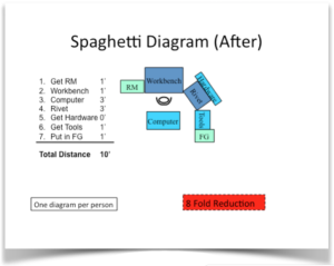
Now, look at the “After” diagram below. By simply rearranging the same equipment, we’ve been able to reduce Excess Movement to 10 feet. So what?
The time not spent walking is time spent making product. Going back to the original premise that “Value is anything for which the customer will reimburse you,” there is no value in movement; it doesn’t make the product any more valuable.
Premise #2: “Any cost not borne by your customer comes out of your profit.” Hence, any reduction in movement is a reduction in YOUR cost.
An example might help. I once worked with a computer cabinet maker. The sheetmetal components were large and scattered around the workstation. A spaghetti diagram revealed that the operator walked over a quarter of a mile in the assembly of one cabinet.
Let’s do the math. If a human walks at a rate of 3 MPH, then a quarter of a mile takes five minutes to walk. Removing the walk time, by placing all the components within arms reach, this operator was able to assemble one more cabinet a day. Not only did we remove cost, we increased productivity. Oh, and the operator exerted less work in the making of the products. Everyone won.


